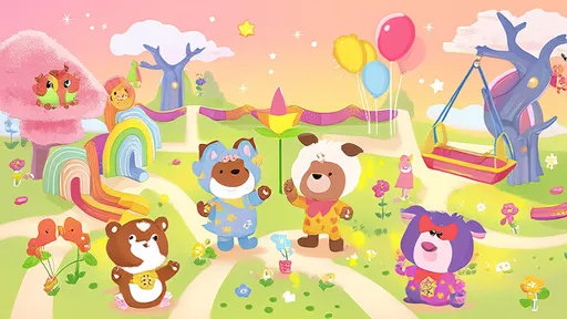
From the moment a child opens a picture book, color plays a silent yet powerful role in shaping their reading experience. Unlike adults who process stories primarily through text, young readers rely heavily on visual cues to interpret narratives, emotions, and underlying messages. The strategic use of color in children's book illustrations isn't merely decorative—it's a psychological language that speaks directly to developing minds.
Research in developmental psychology reveals that children begin responding to color preferences as early as three months old, long before they understand shapes or narratives. Bright, saturated hues tend to capture their attention first, which explains why many classic children's books feature vibrant primary colors. However, the most effective contemporary illustrators understand that color psychology extends far beyond simple visual stimulation. The emotional temperature of a story—whether it's meant to feel adventurous, comforting, or mysterious—can be subtly controlled through thoughtful color palettes.
The emotional resonance of warm colors in children's literature cannot be overstated. Reds, oranges, and yellows naturally convey energy, excitement, and positivity. When used strategically, these hues can highlight important characters or action sequences, guiding young eyes across the page. Yet experienced illustrators often temper these bold choices with complementary cool tones to prevent visual fatigue. The interplay between warm and cool colors creates natural rhythm in picture books, much like musical phrasing in a song.
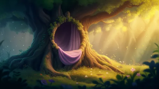
Cooler tones—blues, greens, and purples—serve different but equally vital functions in children's book art. These colors tend to have a calming effect, making them ideal for scenes requiring focus or emotional connection. Many illustrators use cooler palettes for bedtime stories or moments of problem-solving within narratives. Interestingly, the specific shade matters tremendously; a deep cobalt blue might suggest mystery or nighttime, while a soft aqua could imply tranquility or healing. The most skilled artists use these variations to support character development and plot progression without a single word of text.
Beyond basic color theory, cultural associations play an increasing role in modern children's publishing. As picture books become more globally distributed and culturally inclusive, illustrators must consider how color symbolism varies across different societies. While white might represent purity in some cultures, it signifies mourning in others. The growing emphasis on diverse representation has led many publishers to collaborate with cultural consultants, ensuring that color choices resonate appropriately with international audiences.
Color contrast and accessibility represent another critical consideration in contemporary children's book design. Approximately 1 in 12 boys and 1 in 200 girls experience some form of color vision deficiency. Leading illustrators now frequently test their work using color blindness simulators, ensuring that important visual information isn't lost to readers with color perception differences. High-contrast combinations like black on yellow or blue on white help maintain clarity for all young readers, while also benefitting those with typical color vision by creating visual hierarchy on the page.
The emotional development of children adds another layer of complexity to color selection. Younger readers often respond best to simple, bold color schemes with clear emotional signals—bright red for danger, sunny yellow for happiness. As children mature between ages 5-8, they become capable of interpreting more nuanced color symbolism. Middle-grade chapter books frequently incorporate more sophisticated palettes to match this cognitive development, using muted tones or unexpected color combinations to suggest complex emotions or moral ambiguity.
Seasoned illustrators often develop signature color styles that become instantly recognizable to young readers. Consider the distinctive earthy tones of Beatrix Potter's woodland scenes or the psychedelic vibrancy of Eric Carle's collages. These consistent color identities do more than define artistic style—they create visual comfort zones where children can explore new stories with the reassurance of familiar aesthetics. Publishers frequently seek this balance between novelty and familiarity when commissioning new works.
Emerging research suggests that color choices in children's books may influence memory retention of story content. A 2022 Cambridge study found that children recalled narrative details 23% more accurately when key elements were illustrated in high-contrast, emotionally appropriate colors. This has significant implications for educational publishing, where information retention is crucial. Science and nonfiction picture books increasingly use color-coding systems to help young readers categorize and recall factual information.
The digital age has transformed color possibilities in children's publishing. While traditional printing limitations once restricted illustrators to certain palettes, digital formats allow for luminous colors and effects impossible on paper. However, this freedom comes with new challenges—screen colors appear differently across devices, and overstimulation becomes a real concern. The most successful digital children's books use color with the same psychological intentionality as print editions, just with expanded technical possibilities.
As the children's book market grows increasingly competitive, color psychology has become a crucial tool for making titles stand out. Publishers now routinely conduct focus groups with child audiences to test color responses before finalizing illustrations. What emerges from this process are books that don't just tell stories through words and pictures, but through carefully orchestrated color experiences that guide young readers emotionally and cognitively through each narrative journey.
The next time you browse the children's section of a bookstore, take a moment to observe how color works across different titles. The most enduring and beloved children's books invariably demonstrate masterful use of color psychology—sometimes bold and obvious, sometimes subtle and sophisticated, but always in service of creating that magical connection between young minds and the stories that shape them.

By /Jul 9, 2025
By /Jul 9, 2025

By /Jul 9, 2025

By /Jul 8, 2025

By /Jul 8, 2025

By /Jul 8, 2025

By /Jul 8, 2025

By /Jul 8, 2025

By /Jul 8, 2025

By /Jul 8, 2025

By /Jul 8, 2025

By /Jul 8, 2025

By /Jul 8, 2025
By /Jul 8, 2025
By /Jul 8, 2025

By /Jul 8, 2025

By /Jul 8, 2025

By /Jul 8, 2025